Mockitt - Free Page Design Tool
Ultimate Tips For Page Design
- How To Design A Specific Page
- Best Page Design Examples
- How To Create An Online Page Design
- Inspiring Page Design Ideas
Payment Page Design Examples and Checkout UX Notes
When you have a commercial website, you have many reasons to care about the payment page design. It is the mirror of your organization and what makes your visitors and customers happy. For a related workflow, see AI.
No one wants to engage with a site with a final checkout and payment page that regularly neglects to renew. Even though the visitors judge the login and main pages, the payment page must be fast and information encrypted.
Use Mockitt to prototype the payment interface and review the checkout flow before development. A prototype can demonstrate screens and interactions; it does not process real payments.
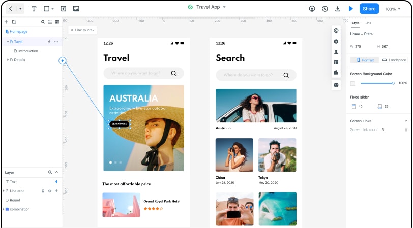
Design a payment page prototype online
Use Mockitt to arrange checkout fields, order summaries, and navigation in a payment page prototype. Review the layout and interaction states with your team before implementation.
Start with the devices your customers actually use. Review both desktop and mobile layouts instead of assuming that a particular age group uses only one device.
For a mobile checkout prototype, keep labels readable and allow room for input errors, order details, and the payment action. Test the flow with realistic tasks and fictional payment details.
A Mockitt prototype does not provide payment processing or certify the security of a production checkout. Production security depends on the payment integration, implementation, access controls, and testing. An HTML export or a padlock in a design is not evidence that a payment system is secure. Use fictional card and customer data in prototypes.
The application can also propose several payment page design examples that will give you a glimpse into what needs to be implemented for people to feel innovative when entering the payment section.
Use the examples below to discuss checkout usability. They are design references, not alternatives to a payment provider or evidence of a secure implementation.
8 Payment Page Design Examples
The screenshots below are historical design references. They may differ from the current websites. Assess their layout and flow without inferring current availability, security, conversion rates, or payment speed.
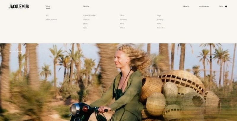
#1: Jacquemus
The Jacquemus example can be used to discuss visual consistency between a product page and checkout. Compare the typography, spacing, and emphasis of the payment action when reviewing your own design.
When prototyping an account-based checkout, make the sign-in and guest options clear. Payment speed, encryption, and data retention cannot be verified from a screenshot.
#2: It's Watch
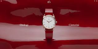
The designers of this checkout payment page have shown that simplicity is the best rule. They point out the card payment page design, giving a white background to the visitors. Experts say that this background removes distractions from customers and allows them to focus on the payment procedure.
Browser compatibility and behavior on a slow connection require testing in the implemented checkout; this screenshot cannot establish either.
#3: InVision
This is a historical InVision checkout screenshot. InVision's Prototype and DSM products ended on December 31, 2024, as described in Miro's announcement. It is not a current service recommendation.
For a returning-customer flow, prototype how a user selects or updates a payment method using fictional data. The screenshot does not establish access to credit card history.
Review whether the order summary and billing details are easy to find. A visible checkout design does not demonstrate how sensitive information is stored or protected.
Use this historical example to discuss the clarity of the checkout interface, rather than its current payment capabilities.

#4: Simply Chocolate
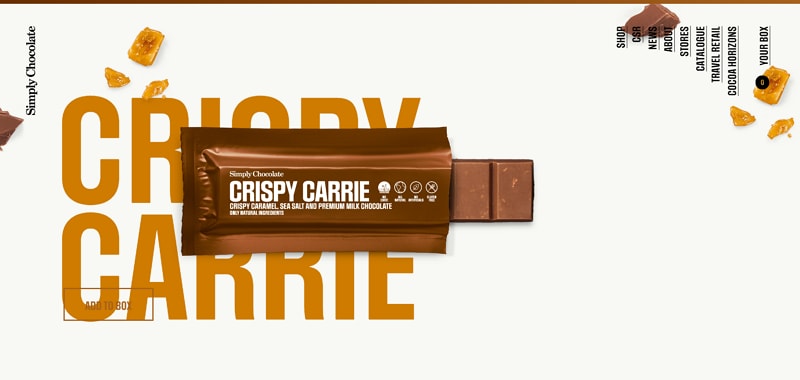
Specialization in chocolate bars and subproducts needs to have a well-organized payment page. The Simply Chocolate website has gained many online customers by merely giving them the best products efficiently.
The payment page option is always close to the right bottom of the screen.
Visitors have the chance to press the button even when their cart is not ready. Most of them can see their transaction history through the payment page.
Finally, the Simply Chocolate payment page also supports many languages and has a different template than the other pages for people to know that they need to proceed with paying.
#5: Nixon
A checkout progress indicator can help users understand the remaining steps. In a prototype, verify that its labels match the actual sequence of the flow.
Readable typography and clear field labels support checkout usability. They do not verify transport encryption or the security of the payment integration.
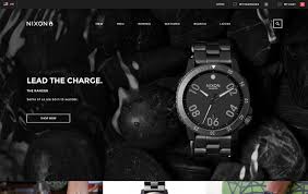
At last, Nixon tries to incorporate a new proposal bar for the payment page. It seems like it can give customers the chance to order more items for a reduced overall price.
#6: Barbour
Barbour has been the online marketplace of choice for many customers in the western world. Even though the payment page remains simple, there are some significant effects.
The menubar takes a different color when people proceed to the payment page. On the other hand, there is always the chance to create viable connections to the customers' accounts.
A checkout prototype should include payment confirmation, a pending state, and a recoverable failure state. Do not promise instant processing: the production payment provider and implementation determine those outcomes.

#7: eBags
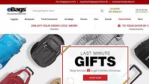
The real innovation in eBags has to do with the live chat add on in the payment pages. For some weird reason, people are always reluctant when the time comes to give their money.
eBags has created a personalized payment page that gets along well with the tastes and expectations of visitors and returning customers.
The payment page supports many languages and can automatically adjust its size to fit all kinds of devices, from mobile phones to desktops.
To assess checkout effectiveness, test task completion and errors with users. A screenshot alone cannot support a claim about sales growth.
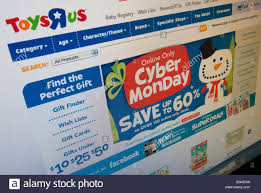
#8: Toys "R" Us
The world-famous toy manufacturer and retailer has managed to create a state of the art payment page for its website. It seems like people use the Toys "R" Us website when they need to buy birthday gifts for their children.
For a gift-purchase flow, make gift receipts and order details explicit. Test what information appears in the confirmation and receipt; do not infer privacy or access restrictions from the screenshot.
The payment page also gives information about the shipping and status of the order.